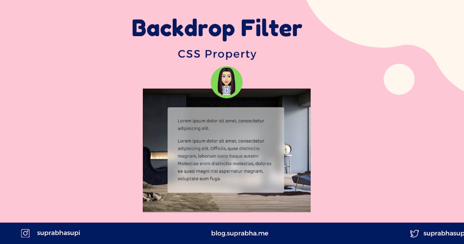
The backdrop-filter property in CSS is used to apply filter effects (grayscale, contrast, blur, etc) to the background/backdrop of an element. The backdrop-filter has the same effect as the filter property, except the filter effects are applied only to the background and instead of to the element’s content.
Content
- What is backdrop-filter and its syntax?
- Apply multiple filter
- Explained with an example
- Browser support
- Reference
Syntax:
backdrop-filter: <filter-function> [<filter-function>]* | none
filter-function can be any one of the following 👇
- blur()
- brightness()
- contrast()
- drop-shadow()
- grayscale()
- hue-rotate()
- invert()
- opacity()
- saturate()
- sepia()
- url() – (for applying SVG filters)
Apply Multiple Filter
Example:
backdrop-filter: grayscale(0.5) opacity(0.8) // .... and more
Let's see an example that how we use backdrop-filter.
Browser Support 🧐
This browser support data is from caniuse , which has more detail. A number indicates that browser supports the feature at that version and up.
Reference 🧐
Thanks for reading the article ❤️
| 📚 Ebooks |

