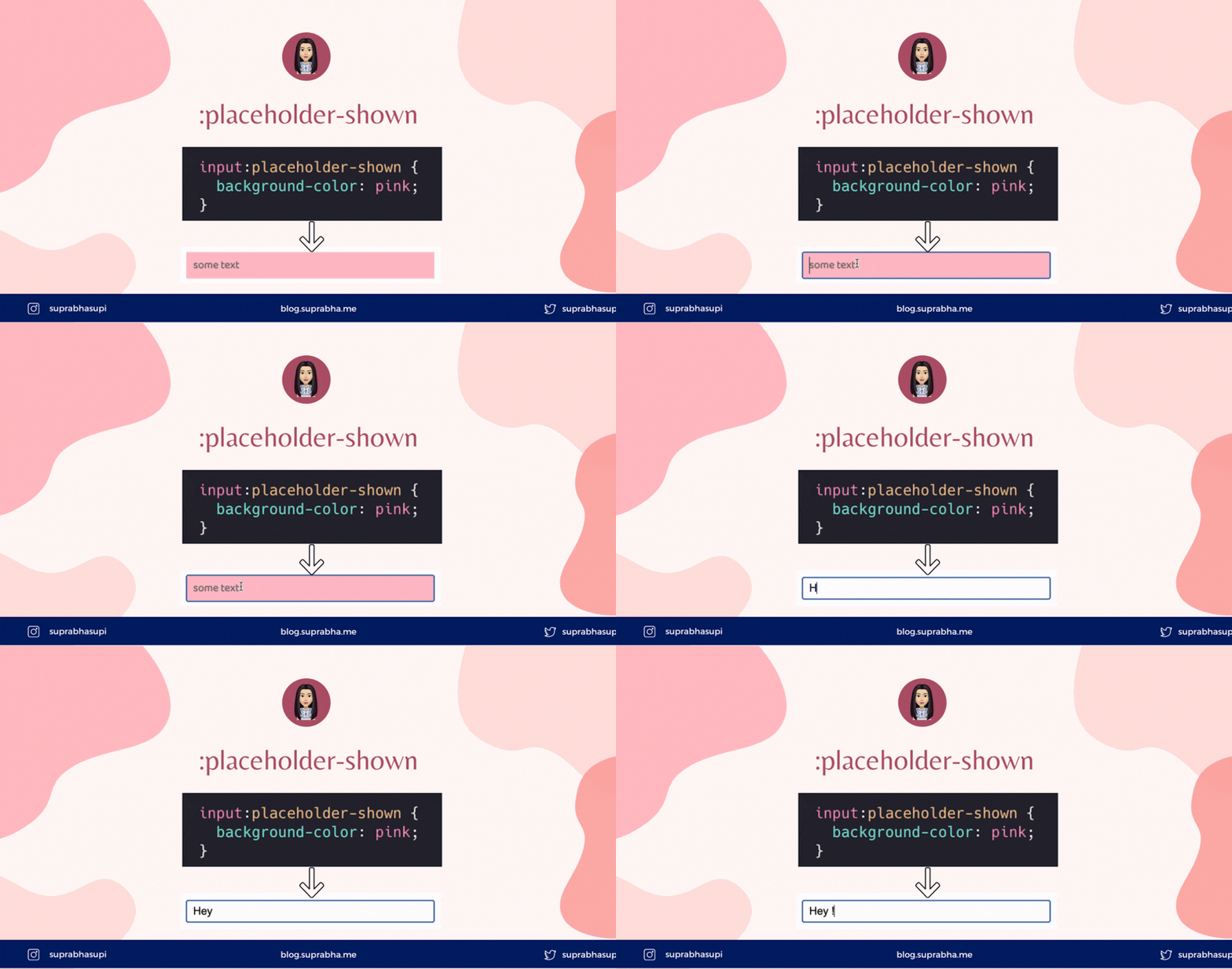
The :placeholder-shown CSS pseudo-class represents any <input> or <textarea> element that is currently displaying placeholder text.
<input type="text" placeholder="some text" />
input:placeholder-shown {
  font-family: "Baloo 2", cursive;
  font-weight: bold;
  background-color: pink;
}
Output:

In above snippet,
- If user has not typed anything then placeholder shown background color will be pink
- When user has typed something then there will be no placeholder shown and the background color will be transparent
📝 NOTE: :placeholder-shown won't work if there will be no placeholder text
🗓 Example:
<input type="text" />
input:placeholder-shown {
  background-color: pink;
}
❌ The above snippet doesn't work
:placeholder-shown vs ::placeholder 🔥
We can use :placeholder-shown to style the input element.
input:placeholder-shown {
  border: 1px solid pink;
  background: yellow;
  color: blue;
}
Here, we set color: blue, but it didn't work. That's because :placeholder-shown will only target the input itself. But for the actual placeholder text, you have to use the pseudo-element ::placeholder.
::placeholder pseudo-element can be used to style the placeholder text in <input> or <textarea> element.
input::placeholder {
  color: blue;
}
Output:

If you wanted to add styles for empty placeholder, we can pass empty string " " as placeholder.
<input type="text" placeholder=" " />
Output:

Now, why don't we combine two selector :not and :placeholder-shown.
So we can target if the input is not empty then we can apply css.
<input placeholder="some text" value="Check with empty!" />
input:not(:placeholder-shown) {
  background-color: pink;
}
Output:

In above snippet,
- If the input has value then the
background-colorwill get applied - If the input is empty then
background-colornot applies
📝 NOTE: ::placeholder does not work with :not selector.
Reference 🧐
| 👩🏻💻 suprabha.me |
